Branding
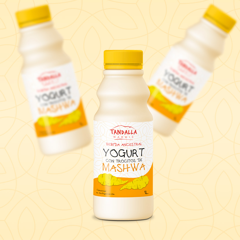
The association of women who won second place at the national level for new ventures based on non-traditional products entrected ec with the design of the image of this innovative product with the idea of capturing their identity in both the name and the label and the label their identity.


As part of the analysis and creative process, a point to highlight was the example of these women, which led ec to decide on the name TANDALLA WARMIS which translated from Quichua to Spanish means: entrepreneurial women united (Tandalla: group work and Warmis: women) in typography as simple as these ladies and in a red color that reminds ec of the strength accompanied by a stylized profile of the Chimborazo snow-capped mountain.
As for the label design, we wanted to ece a yellow color similar to that of the product with a white background to emphasize the typography and a pattern of lines that symbolize the union.
Firstrein Design Company LLC Ⓒ — All Rights Reserved.
Top